
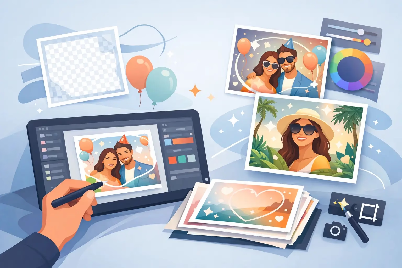
A great photo booth image should tell guests exactly where they were and why the moment mattered. When you design a custom photo overlay, you turn every capture into a keepsake that carries the energy of the event long after the dance floor clears. The best overlays do more than add a name and date. They frame faces well, reinforce the theme, and look just as good in a printed strip as they do in a digital gallery or social post.
For weddings, corporate activations, galas, quinceañeras, proms, and milestone birthdays, the overlay is one of the details guests notice without necessarily realizing why. It makes the experience feel planned, polished, and completely yours.
Start With the Photo Booth Format
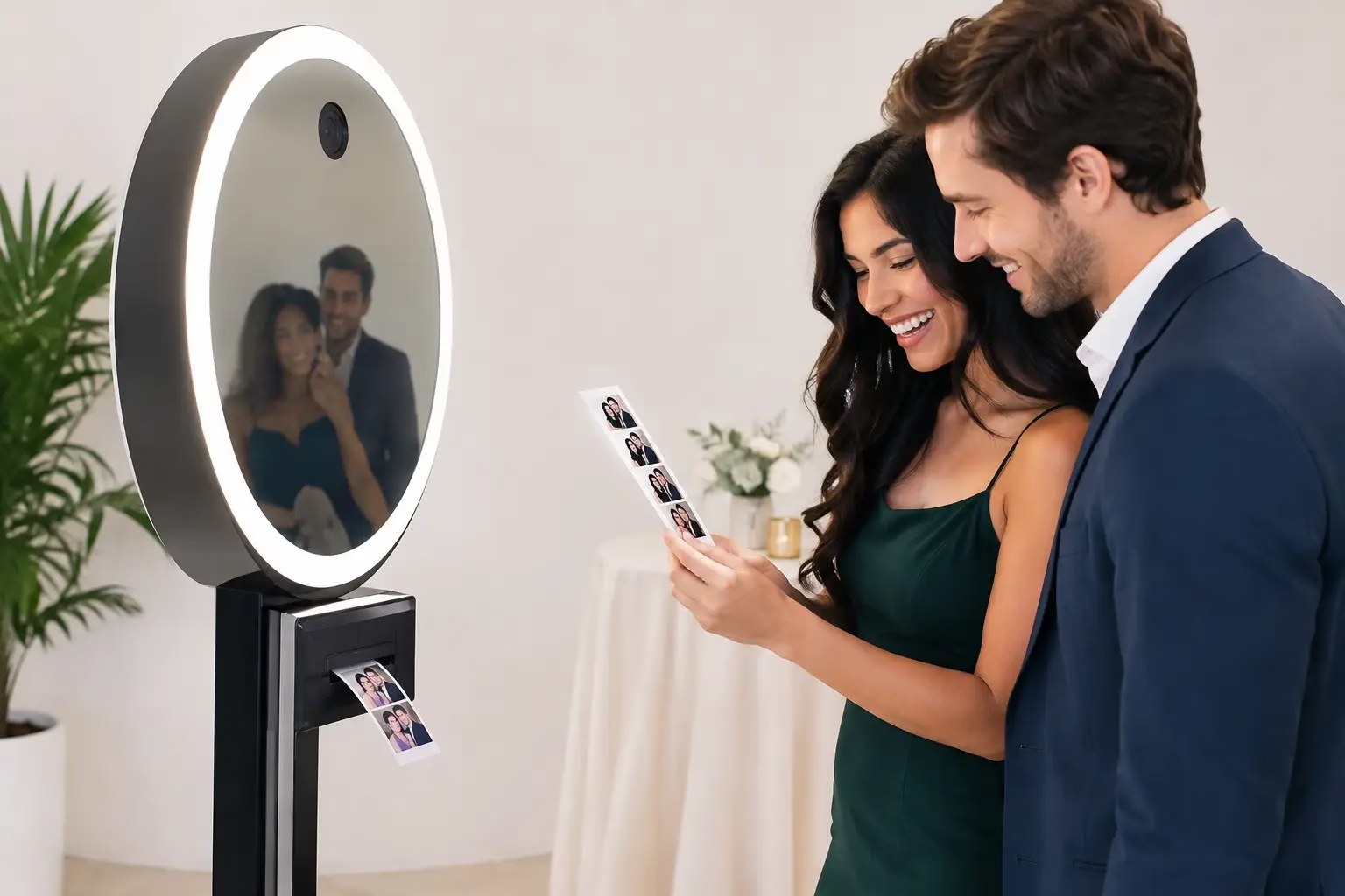
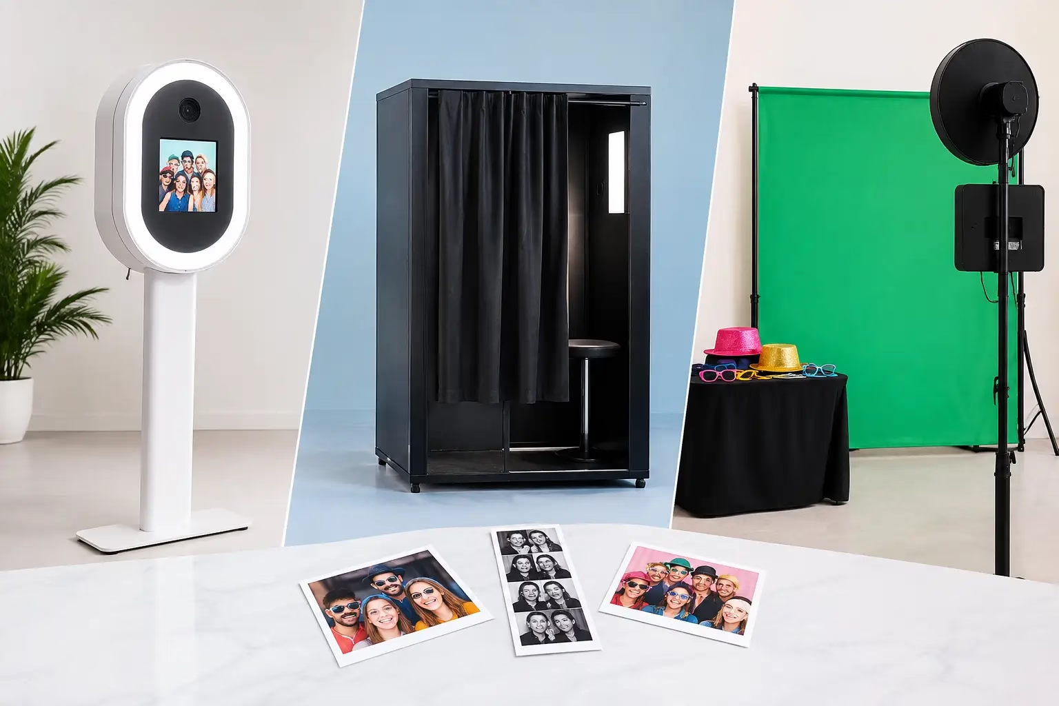
Your overlay should be designed around the booth experience, not squeezed onto a template at the last minute. A classic DSLR booth may produce a vertical photo strip, a landscape print, or a multi-photo layout. A mirror booth often gives guests a more formal portrait-style image. A selfie station leans toward shareable digital content, while a 360 booth may call for an animated graphic treatment rather than a traditional printed frame.
This choice affects everything from the available space for branding to the size of text. A design that looks beautiful on a large phone screen can become hard to read on a 2-by-6-inch print. Conversely, a dense print layout may feel cluttered when it appears as a full-screen digital photo.
Before choosing colors or fonts, confirm the final orientation, print size, number of images per session, and whether guests will receive prints, digital files, or both. That early decision saves revisions and keeps the finished experience intentional.
Give the Design One Clear Job
An overlay can celebrate, brand, direct attention, or do all three in a controlled way. Trying to make it do too much is where designs get busy. Pick the primary purpose first.
For a wedding, the job may be to preserve a classic visual memory with the couple’s names and wedding date. For a company party, it may be to make every guest photo recognizable as branded event content. For a school dance or Sweet 16, it may be to amplify a bold theme guests are excited to share.
Once the purpose is clear, decide what information truly belongs on the image. Usually, that means the event name, a date if it adds value, and a logo or monogram when appropriate. A hashtag can work for social-focused events, but only if it is short enough to read in one glance. Full agendas, sponsor lists, and long taglines are better placed elsewhere.
Match the Personality, Not Just the Color Palette
A custom photo overlay should feel connected to the event from the first look. That does not mean every design needs to copy the invitation exactly. In fact, small adaptations often work better on camera.
A black-tie gala may call for a restrained border, metallic-inspired accents, and a clean serif typeface. A colorful corporate team celebration can handle brighter blocks of color and a playful message. A quinceañera can feature florals, sparkle details, or a crown motif, as long as the design still leaves room for guests to shine.
Think in terms of mood. Is the event elegant, high-energy, modern, nostalgic, romantic, playful, or polished? That answer should guide the design more than a random collection of trendy graphics.
Protect the Photo Area
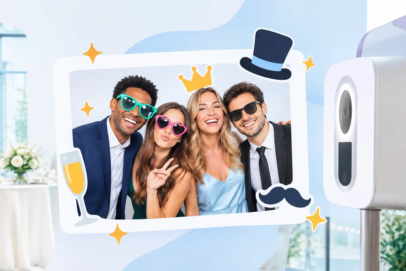
Guests are the main event. The quickest way to weaken an overlay is to place large graphics, text, or logos over faces, hands, or outfits. Build the design around the area where people will naturally stand, pose, and move.
Keep key text in the outer edges, corners, or lower portion of the frame. If the booth captures groups, allow even more breathing room because guests will spread across the image. A small logo tucked into a corner often has greater impact than a large logo competing with every smile.
This is also where testing matters. A design can look balanced as an empty file and fail once real people stand in front of it. Preview it with sample images that include one person, a couple, and a larger group. Check for tall guests, big gestures, hats, and props. The goal is not to make every photo identical. It is to ensure the overlay supports the fun instead of covering it up.
Use Color and Contrast With Intention
Event colors are a natural starting point, but not every color translates equally well to a photo booth overlay. Pale yellow, light gray, and soft blush can disappear against bright lighting or white clothing. Very dark frames can feel heavy in a small print. Highly saturated colors can be exciting, but they may clash with props, venue décor, or guests’ outfits.
Contrast is what keeps the design readable. If you use light lettering, place it over a darker or more solid portion of the layout. If the background is detailed, use a simple badge, banner, or translucent block behind the text. This is especially useful for corporate logos with fixed brand colors that may not naturally stand out over photography.
There is a trade-off between subtle and bold. Minimal designs often feel premium and timeless, especially for weddings and formal events. Brighter, more graphic layouts can drive excitement and social sharing at brand activations, school events, and birthday celebrations. Neither approach is automatically better. The right choice depends on the event’s personality and how guests will use the photos afterward.
Keep Fonts Simple Enough to Read Fast
Photo booth overlays are viewed quickly. Guests see them on a print while walking away, on a phone while sharing, and sometimes in a digital gallery weeks later. Choose fonts that remain legible at a small size.
One statement font paired with one simple supporting font is usually plenty. Script fonts can bring romance or personality, but they work best for a short name, a single word, or a monogram. Use a clean font for dates, hashtags, locations, and any information guests need to read without pausing.
Avoid stacking too many font styles in one layout. It can make a thoughtfully planned event look like a last-minute flyer. Consistent spacing and hierarchy are often more memorable than decorative type.
Make Corporate Branding Feel Like Part of the Party
Corporate overlays need to carry the brand without making every photo feel like an advertisement. The strongest designs borrow a logo, a campaign color, a pattern, or a short event phrase, then leave enough room for people to be themselves.
For a product launch or sponsored activation, a visible logo may be essential. For an internal holiday party or employee appreciation event, a lighter touch may fit better. A custom phrase such as Team Night Out or Celebrating Our People can create a stronger guest connection than a large logo alone.
If multiple sponsors are involved, be realistic about space. Putting every logo on every print can reduce readability and visual appeal. Consider which brand needs top placement and which marks can appear smaller while still receiving appropriate visibility.
Plan for Print and Digital Sharing
A printed photo strip is physical, personal, and often displayed on a fridge or tucked into a scrapbook. Digital images need to work in an entirely different environment. They may be shared vertically in stories, posted to feeds, sent in group chats, or saved in an online gallery.
A smart overlay design accounts for both. Keep essential wording large enough to survive a screenshot. Avoid placing crucial text too close to an edge where a platform crop could cut it off. If your event uses a custom hashtag, make it prominent but not oversized.
For events using animated GIFs, boomerangs, or 360 video, ask whether the static overlay needs an animated companion design. Motion graphics can add serious wow factor, but only when they support the event theme and do not distract from the people in the clip.
Let the Details Be Handled Before Event Day
The best time to finalize an overlay is before setup begins. Gather the logo files, invitation or campaign artwork, exact spelling of names, event date, and any required brand language early. A clear approval process prevents the stressful event-day discovery that a name is misspelled or a logo is outdated.
At Fun Fun Party, custom event branding is part of creating a booth experience that feels made for the room, not pulled from a generic template. A professional team can also help spot practical issues, such as text that may print too small or a layout that needs more space for group photos.
Bring your theme, your colors, and the feeling you want guests to remember. Then let the overlay do its quiet but powerful work: turning every laugh, pose, and unexpected photo booth moment into a keepsake that still looks worth sharing tomorrow.
Leave A Comment